Logo Animation
Client
Loman-Ray Insurance, LLC
Role
Concept, animation
Loman-Ray Insurance challenged me to come up with an animation that would somehow incorporate the colors and segments of their shield in a creative way. They wanted the animation to display comfortably in a variety of contexts such as on their website and before their videos. The result is an animation that tells a story and incorporates their brand perfectly.
Concept
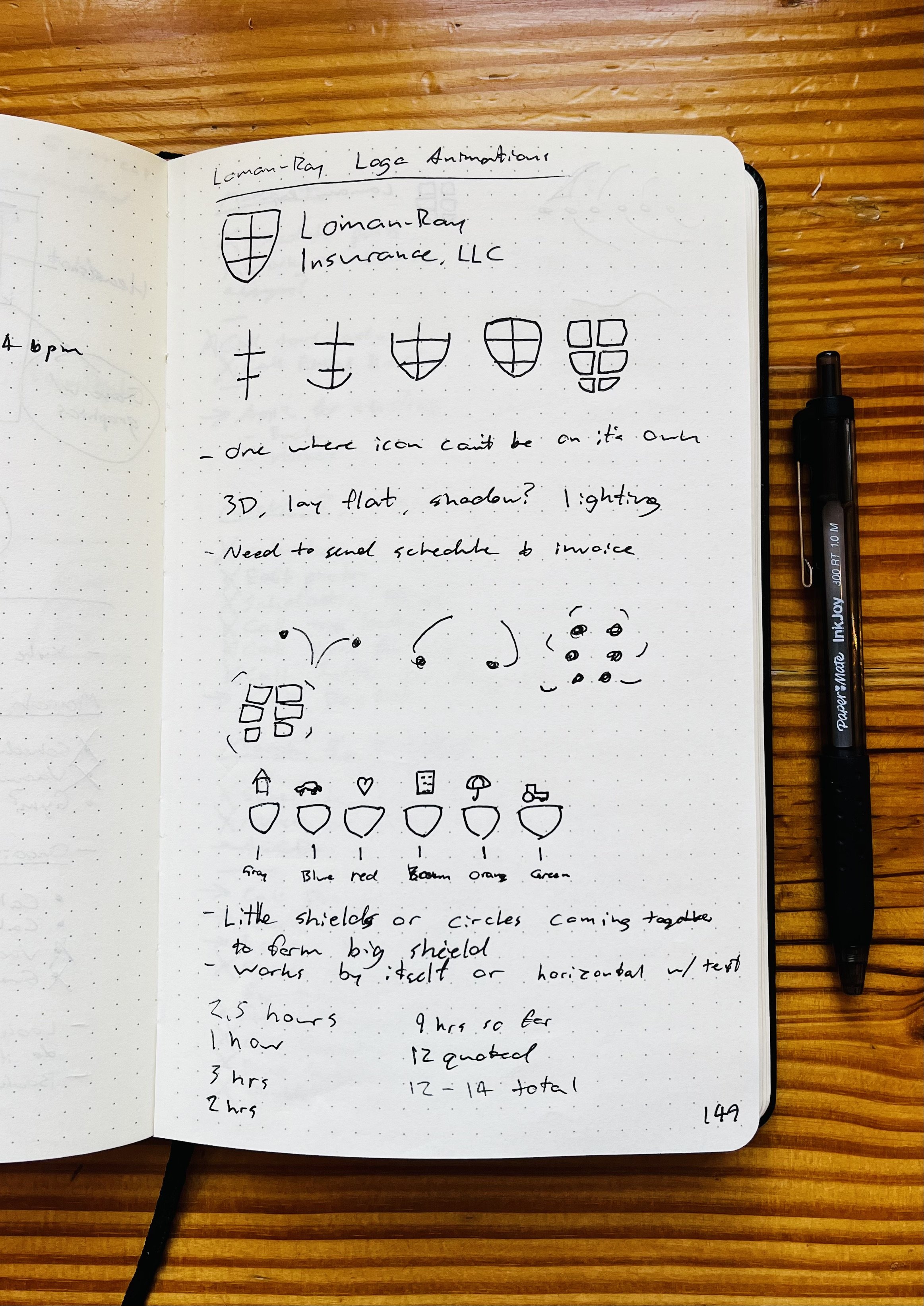
During my discovery phase, I was inspired by a page on their website that attributed each segment of their shield to an area of insurance that they cover. The solution I came up with starts with each segment on its own before combining to create the Loman-Ray shield.
When in doubt, sketch it out
Sometimes I see a logo that could be animated in a number of different ways. It can be hard to pin down which is the best way that fits the budget, timeline, and needs of the client. This was one of those times.
I ended up sketching out a bunch of different options and even animated a few to show to my client. They chose to go with the version you see today and I think they made the right choice. As the old saying goes, “The customer is always right.”


